


Using colour in web design can really make or break web design and or layout. Over the years i’ve developed experience and figured out some ground rules on how to work with colour within my website designs. It’s not rocket science but did take a while to get comfortable with using colour. Use some of these tips and tricks to get the most out of your web design and start embracing colour.
Photoshop libraries are not only great for storing design assets and elements but at minimum, I urge you to start developing your colour pallets in them. Every new design project I start – the first thing I’ll do is create a new library for it. First thing i add in there is all the brand colours I want to use.


Now by this I mean try not to use solid hard colours like a solid blue or solid green or red. Instead, mix other tones into the colour you’re after. In the example below I’ll show you how to work with red tones in a nicer and warmer way. Red typically is a warning colour and tricky to work with, but just by reducing the amount of red in the tone and introducing some yellow you get a nice pastel colour to work with.
Using colour in web design can really make or break web design and or layout.

I love my grey tones, they just work with almost any colour and are a amazing neutral colour to work with.

Once you have a good grasp of working with greys you can start to mix it up and start getting really nice results by simply adding colour tones to your greys.
I typically will add a bit of blue or red to my greys to give them either more warmth or give them a more corporate feel. This is easily done in Photoshop by moving the colour picker tool into the blues or reds whilst still hovering in the general grey area.
I gave up on using black in my designs many years ago. I put it on par with giving up having sugar in your coffee, it feels weird at first but once you come around to the idea it starts to make more sense. Try using dark greys instead of 100% black tones. Dark greys have a more subtle feel to them whilst still feeling dark. If you use a dark enough grey you really wont be able to notice it’s not a black, but the overall design will flow much nicer and start to allow easier integration of other colours to suit.
Blacks a great solid, strong colour to use, but I find myself so much more creative with colour when I don’t use it.
Start a collection of colours you like using or work well. I’ve got a huge collection of different types of greys, pastel colours and just generally colour pallets I’ve enjoyed working with. These come in really handy when you’re struggling to come up with a new colour pallet or you just need one more colour to work with inside of a design.
When you find colours you enjoying working with it’s always nice to experiment with them and see how else you can arrange and use them. Having that base of colours means you’ve got a starting point.
When it comes to getting inspiration for colour online there’s a vast amount of references out there to look at. A couple I’ve found to be really good and helpful are:

Flat UI colours is a great collection of colours to get started from if you’re into the flat design trend!
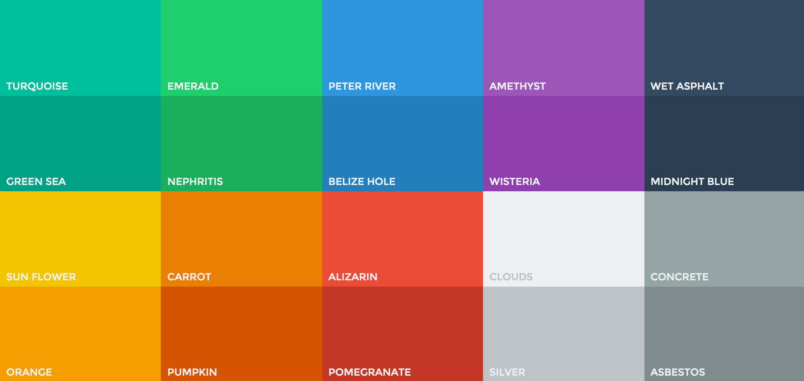
Similar to flat ui colours, Tint UI gives you a great starting point for some nice vibrant colours with a few more options and more functionality.

UI gradients is a great site to get your gradients on! They use vibrant colours with some great colour combinations to work from.

I hope this post has given at least some of you out there a couple of ideas to try when next tackling your colour problems.
I’m by no means finished this post and hope to resurrect it soon as I can document some more of the processes I go through when using colour.
Would love to hear your feedback and comments and or suggestions you may have.
Main banner image by Chris Phutully some rights reserved
Liked that article or free file? But of course you did! Be sure to check out some similar articles by joining our weekly newsletter.
Join the thousands of people on BlazRobar.com newsletter that get updated on the latest release of free design files and articles.
Leave your email if you love this tool or to get notified when we release new features.
Login to check your commision and sales amounts.